Design Preview
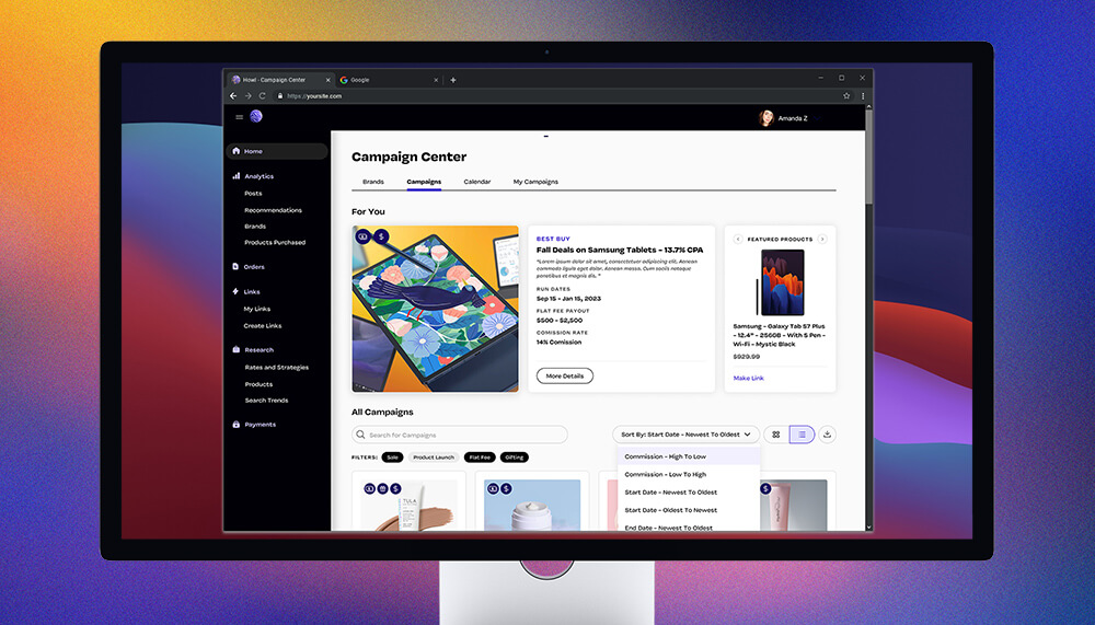
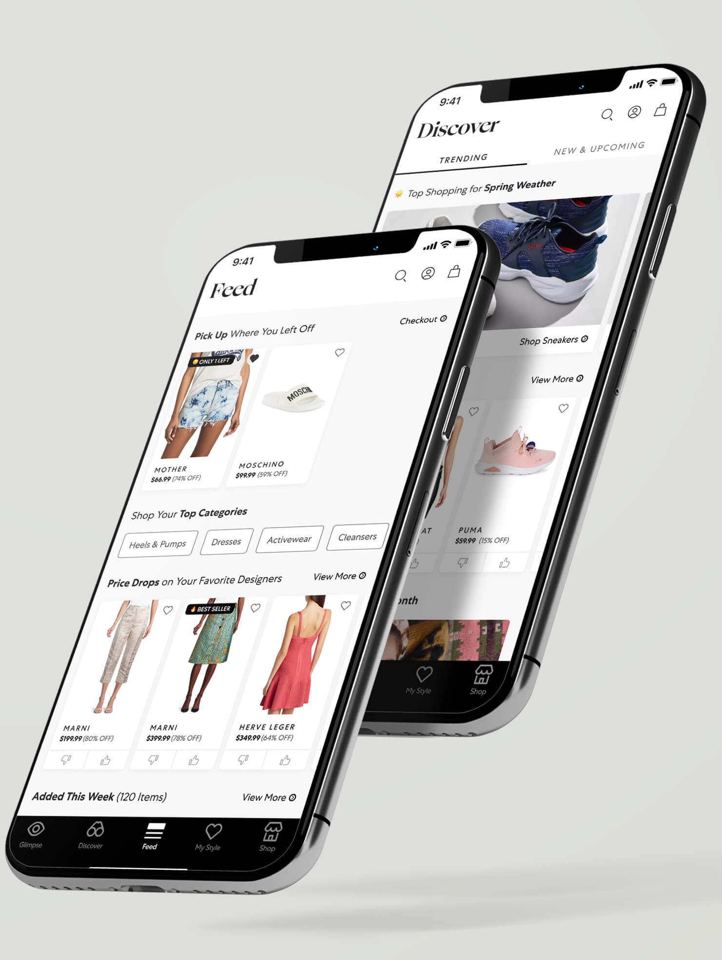
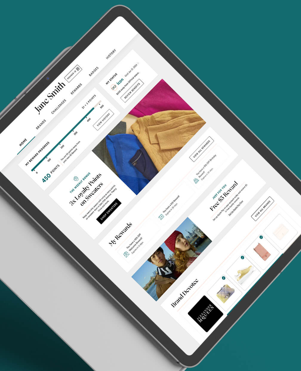
Howl Platform
Howl is a social commerce platform designed for creators and brands. I was contracted to lead design on the ecommerce platform and built a number of experiences over the course of my year long engagement.
[UX, UI, Product Strategy]
CASE STUDY
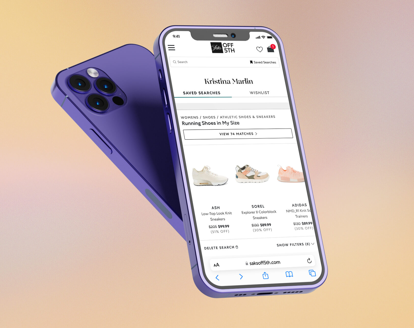
Saved Search
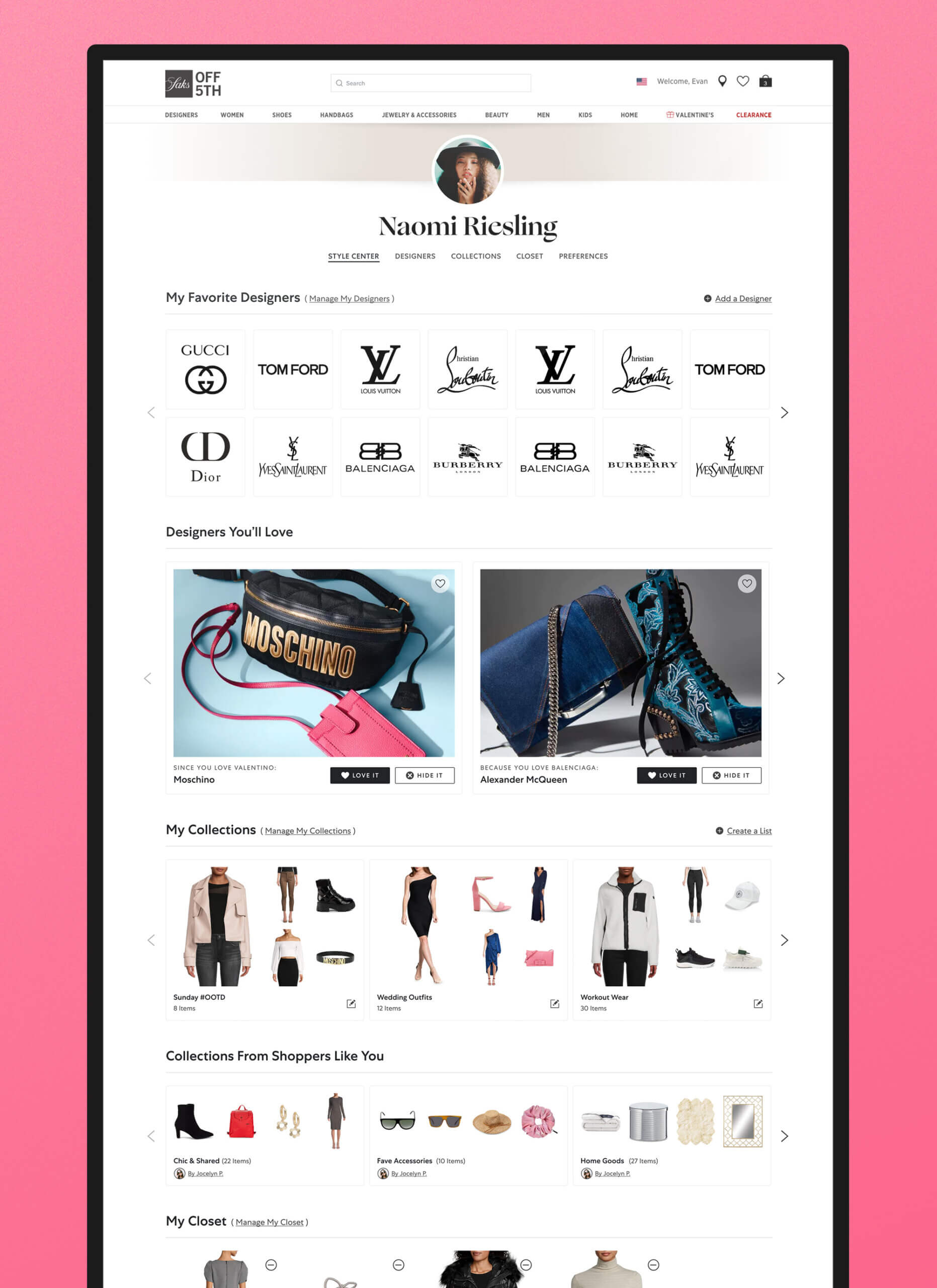
Saks OFF 5TH wanted to increase customer return visits and gather user insight data while providing a useful shopping tool. I planned, designed, and tested a feature called "Saved Search" in response.
[UX, UI, Product Strategy, User Testing, Interactive Prototypes, A/B Testing]
DESIGN CHALLENGE
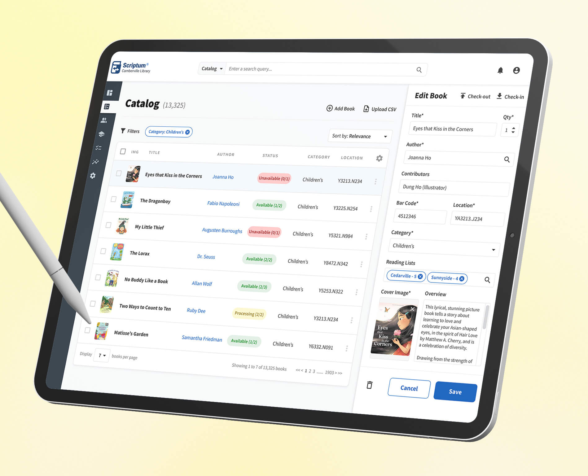
Library Management
I was challenged to design a library management system for the Camberville Library to track and manage the inventory of children’s books and summer reading lists, plus the kids who check them out.
[UX, UI, Whiteboarding]
Design Preview
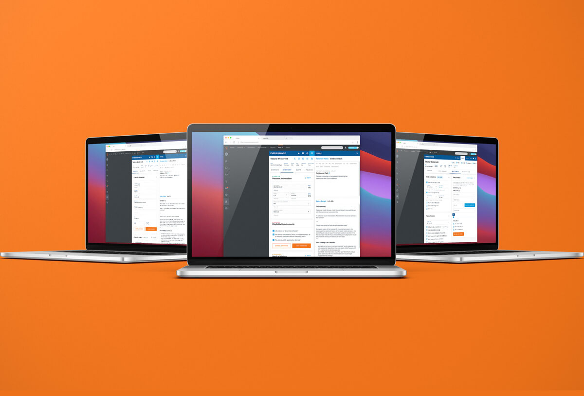
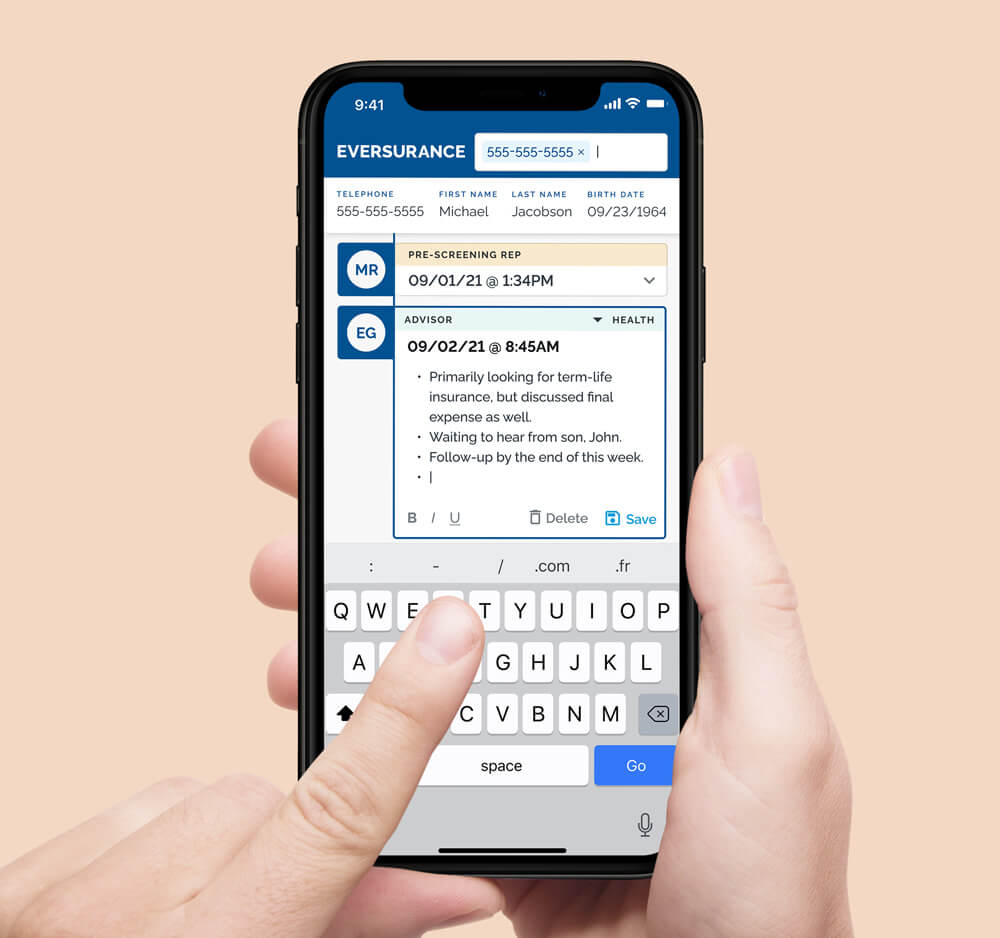
OMNI Tools
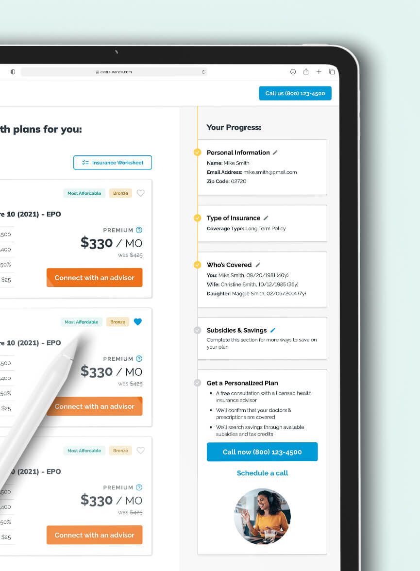
Everquote's new line of business, Eversurance, needed a set of tools to empower both life and health advisors when working with customers on the phone. The tools needed to work across a suite of external applications and on small display sizes. Plus, they needed to be launched fast.
[UX, UI, Product Strategy, User Testing, Interactive Prototypes]
CASE STUDY
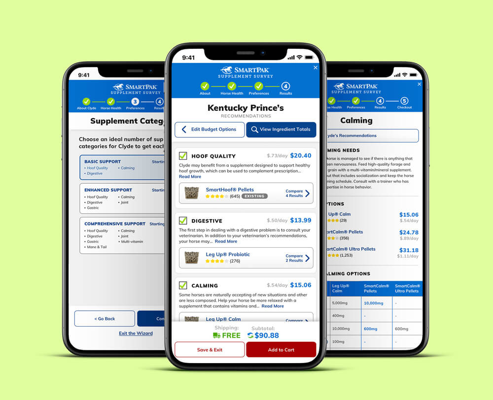
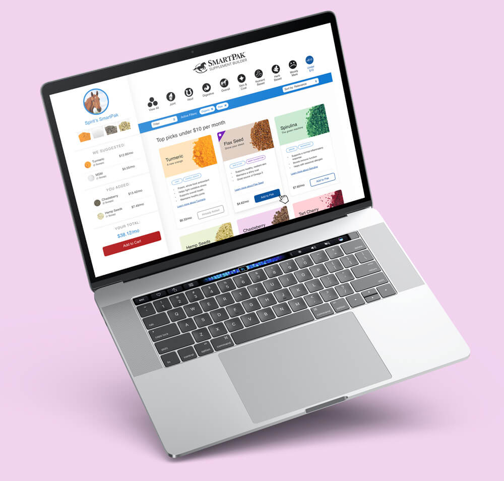
Supplement Wizard
SmartPak’s Supplement Wizard originally launched in 2010 and was loved by many. Users could answer a series of questions about their horse’s health and would receive custom supplement recommendations. For a long time it had been a big driver for company growth. But by 2019, it had seen better days. Conversions were falling fast.
[UX, UI, User Testing, Interactive Prototypes, A/B Testing]
Case study
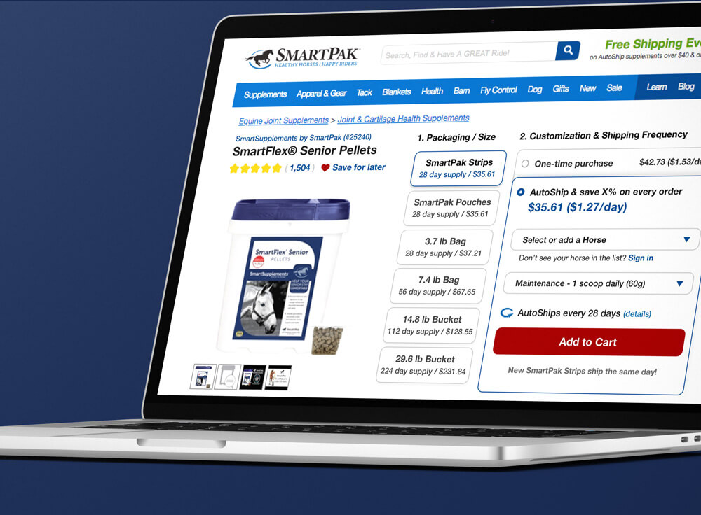
Order Control
In early 2018, SmartPak introduced an AutoShip discount program to encourage customers to grow recurring revenue. A rudimentary AutoShip option was present in the order control, but it tended to be a frequent customer pain point. The order control itself was often called confusing and it took up a lot of vertical space.
[UX, UI, Product Strategy, User Testing, Interactive Prototypes, A/B Testing]
